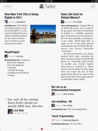
I did some poking around how Flipboard lays out content, and here are my observations.
1. The portrait and landscape layouts are identical -- the internal content of an article reflows when the orientation flips, but the overall article layout remains exactly the same. So in the rest of this, I'll only refer to the portrait orientation.
 2. The layout process is almost certainly "recursive rectangle
cutting" rather than packing a set of rectangles. In other words,
start with a big rectangle, then make a complete cut horizontally or
vertically, and recursively cut each smaller rectangle. The tell-tale
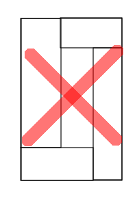
sign of such a process is you never see a layout like this.
Ie, there is always at least one cut that goes from one side of
the rectangle being cut to its opposite side, and so on, recursively.
3. You can therefore associate a "cut tree" with any layout, where each node represents a cut -- horizontal or vertical -- and is labelled with the location of the cut position(s). The choice of cutting positions are heuristics, and Flipboard's approach seems to be to pick small integer ratios of the parent.
If you ignore "dual" ratios (eg: 1/3 and 2/3 would be duals of each other) Flipboard picks cut positions that are located 1/2, 1/3, 1/4, 2/5, and 3/8 of the parent. Which one to pick at any step is possibly a combination of how large the content is, and some randomization.
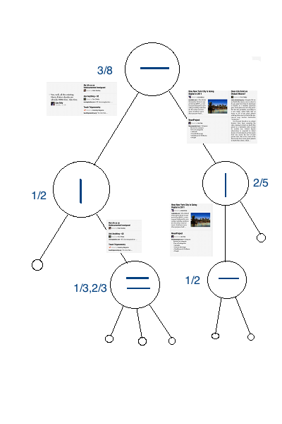
For example, this layout

corresponds to this cut tree.

There are very likely more constraints in use, for example vertical cuts never use the 1/4 ratio, and further, a "vertical cut node" avoids vertical cut children in its subtree. For instance, a layout that has a root vertical cut (so it goes from top to bottom) never has any other vertical cuts. There can of course also be more than one cut tree that produces the same layout -- eg: a layout that's divided into four equal-sized quadrants has two equivalent cut trees, depending on whether you start with a horizontal or a vertical cut.
That said, there's more than one way to approach the problem, and it can be useful to understand the underlying design goals, rather than view it as purely a problem of "packing" content. (Example via Gridness)

Many modern designers and magazines layout content within a grid, and you can see an example about the underlying ideas here.
In essense, the page is divided into a grid that resembles a checkerboard, and each element of interest is reflowed into a contiguous subset of blocks. The intent is to establish a visual structure to the content, which the grid helps to maintain. Whitespace is often just as important as content, and eventually each grid block ends up being either used as content or whitespace. (This is often overlooked in many "packing" approaches to layout, though you may be able to incorporate it as "blank content" to be packed along with everything else.)
Being aware of an underlying grid can potentially simplify algorithms as well as allowing internal content to settle along grid lines. A fairly basic approach can still use rectangle cutting, but just select one of the grid lines at each cut (rather than ratios of the parent, as Flipboard does.) It can also allow you on occasion, to create non-rectangular areas, especially with reflowable content. For example, you may be able to subtract a set of blocks out of an enclosing rectangular set, to add related content, and so on. You can see it in the pullquotes in this example from the Behance Network.
